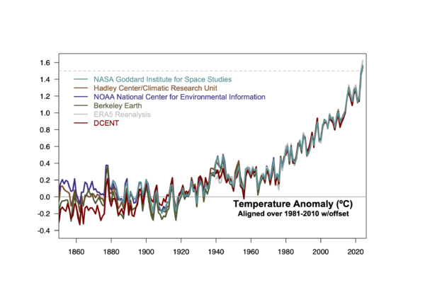
To no-one’s surprise 2024 was the warmest year on record – and by quite a clear margin.

Another year, another data point. Unlike the previous year, 2024 was anticipated to be a record breaker even before it began (I predicted a record – despite the huge anomaly in 2023 – with a 55% probability). It did fall at the higher end of the prediction, so maybe we are seeing the same issues that we saw in 2023 continue into another year. We shall see!
Anyway, we will be updating the climate graphs and model-observation graphs over the next week or so, but in the meantime, a couple of things are worth exploring this year are the estimates of the anomaly from the pre-industrial (nominally 1850-1900), the very large difference between the surface records and the MSU-based records.
1.5ºC or not 1.5ºC
The people have spoken, and they have collectively agreed that ‘pre-industrial’ can be thought of as the average of 1850 to 1900. There were other candidates – but the influence of IPCC AR6 is too strong to fight against. So, while I’ve been holding on to ‘late 19th Century’ (in practice 1880-1899) as a baseline, I have bowed to the inevitable and started producing anomalies with respect to the earlier baseline. But that raises a problem – how do you produce an anomaly with respect to a baseline that isn’t in your data set? This is not just a problem for GISTEMP, but it’s also an issue for the reanalyses like ERA5 and JMA-3Q.
There are a number of options. The one we chose is to make an alignment in the 19th Century over the common period in the records (1880-1899) and then use the average of three datasets that go back further to make a small adjustment. The difference between 1880-1899 in HadCRUT5/NOAAv6/Berkeley Earth and 1850-1900 is small (about 0.038ºC currently with the 1880-1899 period being slightly cooler). So for GISTEMP, you need only add 0.19 to the standard baseline anomalies (which are based on 1951-1980). If we included DCENT in this alignment, it would be a 0.022 offset, a net change of 0.20.
This method does however depend on the period over which you choose to align the records. The more recent a period, the closer the long term difference will align with the average of the three longer records and the less independent any estimate will be. The reanalyses which only go back to 1940 and 1948 respectively have fewer options. ERA5 (Copernicus) chooses to align the 1991-2020 period to the average of the three data sets. That would give an offset of 0.889ºC at present. However, this estimate was first calculated for the 2021 AR6 report, at which point the value was 0.88ºC (with a calculated uncertainty of ±0.12ºC). Copernicus has chosen to stick with this same number subsequently (even though the datasets it was based on have updated slightly since then). The semi-official ‘WMO’ assessment (which John Kennedy puts together), does something else again. They add a 0.69ºC (±0.12ºC) offset to the average of the records (GISTEMP, NOAAv6, HadCRUT5, ERA5, and JMA-3Q) baselined to 1981-2010. That too is a function of the calculation made in 2021, and if you did it again now you’d get 0.697ºC. These are minor differences, but they do underline that the pre-industrial values are more uncertain, and as datasets evolve (with more digitization of old data, updated corrections for non-climate inhomogeneitites, these estimates will evolve too.
What’s the best way to visualize all this? The uncertainty is all in the earliest period, but if you use a pre-industrial baseline that would move all the variance to the modern period. So, the alternative is to align the records in the modern period and then apply a average offset for the baseline change for all of them.


The value for 2024 in this graph is then 1.54±0.07ºC. However, this is sensitive to the inclusion of the DCENT record and to any further updates in the earlier parts of the records. There isn’t a perfect answer here, but comments on what to do (for different purposes) are welcome below.
Ummm… MSU
With much of the focus on the longer-term records, it seems to have flown under the radar a little how oddly the MSU/AMSU records have been behaving over the last year or so. As with the surface records, the satellite products (UAH, RSS, NOAA STAR) all have 2024 and 2023 as the warmest and second warmest years, but unlike the surface records, 2023 was not such a outlier (~0.06ºC above 2016), while 2024 was huge (with records broken by ~0.32ºC). Additionally, the time over which the peak temperatures have lasted (17 months or so) is much shorter than the peaks around 2016 or 1998 (7 months). I don’t have much insight into why this is happening, but it might hold some clues about the drivers of the recent anomalies.


Leave a Comment